


Picture this: You step into a restaurant, the tantalizing aroma of your favorite cuisine wafts through the air, and your anticipation builds. Yet, before you even catch a glimpse of the menu or the chef's creations, something else captures your senses, the colors that surround you. They are not just mere decorations; they are the invisible artists setting the stage for your dining experience.
In the world of restaurant design, where every element counts, colors play a pivotal role in creating the perfect ambiance. The choice of colors sets the stage for the dining experience, impacting everything from mood and appetite stimulation to brand identity and cultural authenticity. “Just as a chef carefully selects ingredients to craft a delightful meal, designers meticulously choose colors to set the mood and enhance the dining experience. Colors are a vital part of a restaurant's brand identity.,” Dhruva Kalra from I'm D'sign stated.
Setting the Tone
Colors are powerful communicators of emotion and atmosphere. When you enter a restaurant, the first thing that strikes you is the color palette. Warm and earthy tones like browns and oranges can create a cozy and intimate setting, ideal for a romantic dinner. In contrast, vibrant reds and yellows can energize a space, making it perfect for a lively, social gathering. The choice of color sets the tone for the entire dining experience.
Spread over 5,100 square feet over two levels, The Earthy Woven Café has been designed by Suhani Lal Sanghra, principal architect, Sparc Design using hues of beige and light wood with splashes of saffron orange and green from the foliage.
The architect team decided on a neutral and earthy theme with cane, wicker, and clay to match the vegetarian food concept. “The orange pop of colour has been used keeping in mind its relevance to the context often associated with warmth and comfort, thereby enhancing the overall experience. Orange is known to stimulate the senses and increase appetite; it also helps with branding and a strong visual recall,” says Sanghra.
Brand Identity
Restaurants, like any other business, seek to establish a unique brand identity. Colors are integral to this process. They serve as the visual representation of the restaurant's personality and values. For example, a rustic farm-to-table eatery may employ earthy greens and browns to emphasize its commitment to nature and wholesome dining, while a modern fusion restaurant might opt for sleek blacks and metallic accents to convey innovation and sophistication.
“Think of McDonald's and its iconic red and yellow color scheme. It's not just about decorating; it's about establishing a visual identity that customers associate with your establishment. The right colors can leave a lasting impression and make your restaurant instantly recognizable,” Kalra added.
Appetite Stimulation
Believe it or not, colors can influence your appetite. Warm colors like reds and oranges are known to stimulate hunger and make food appear more appealing. This is why many fast-food chains use these hues in their logos and interiors. On the other hand, cooler tones like blues and greens can have a calming effect, which might be more suitable for a fine dining restaurant where patrons savor each bite.
For instance, studies have shown that the color red can increase heart rate and create a sense of urgency, which can lead diners to eat faster. On the contrary, soft blue hues can slow down eating, encouraging a more relaxed and indulgent dining experience.
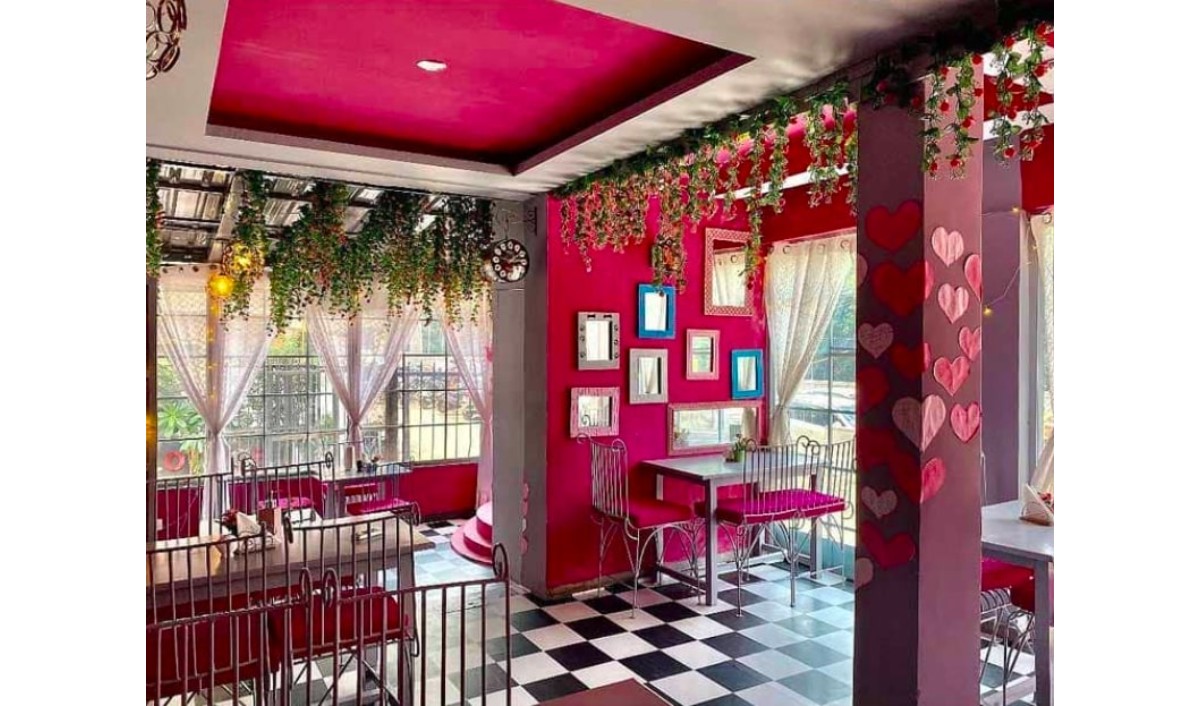
A newly-opened chic cafe, Sista’z is a go-to place for all the millennials. Amalgamating all the fairy-tale vibes and infusing deep rich pink colour into their ambience, this cafe offers a not-so-ordinary feel. They serve a plethora of cuisines like Italian, Continental, Chinese and some must-tries here include their best-sellers such as Beer Butter Onion Rings, BBQ Chicken Wings and Mac & Cheese Casserole Pasta, all with a pink hue.
Space Perception
Colors also have the power to alter our perception of space. Dark colors can make a room feel cozy and intimate, while light colors can open up a space and make it appear more airy and spacious. In smaller restaurants, light and neutral colors are often used to give the illusion of a larger dining area, making guests feel less cramped.
For example, if a restaurant has limited square footage, employing a light color scheme on the walls, furniture, and even the ceiling can create a sense of openness. This not only enhances the comfort of diners but also helps maximize the utilization of available space.
Situated in the centre of the city’s Art Deco district—Marine Drive, Nksha is an inviting North Indian eatery. Conceptualised by Shruti Jalan and Neesha Alwani of ns*a Architecture & Interiors, the restaurant is reminiscent of an old Bombay speakeasy. “Nksha’s interiors showcase plush fabrics, majestic arches, brass accents, ornate chandeliers, repetitive patterns in brass and gold, and an arresting colour combination of coral and forest green. Additionally, the cosy 49-seater restaurant has an open kitchen bathed in green tiles, a glimpse of which can be caught in a ribbed brass and forest green window. The eatery also has a bar that exhibits a similar ribbed brass and forest green aesthetic,” Jalan commented.
Cultural Significance
Colors can convey cultural significance and authenticity. When designing a restaurant with a specific cuisine, such as a Mexican or Italian eatery, using colors associated with that culture can enhance the authenticity of the dining experience. Warm terracottas and yellows in a Mexican restaurant, for example, can transport diners to the streets of Mexico.
Moreover, the cultural significance of colors can extend beyond aesthetics. In some cultures, specific colors may hold religious or symbolic meaning. Restaurant designers need to be mindful of these cultural nuances to create an inclusive and respectful environment.
Balance and Harmony
Effective use of color is all about balance and harmony. Too much of one color can overwhelm diners, while a well-thought-out color scheme can create a pleasing visual rhythm. Complementary colors, such as blue and orange or purple and yellow, can create a sense of balance and harmony in the design.
Moreover, layering different shades of the same color or introducing subtle accents can add depth and complexity to the restaurant's aesthetic. For instance, a Mediterranean restaurant might use varying shades of azure blue to evoke the feeling of dining by the sea.
The role of colors in restaurant design goes far beyond aesthetics. They serve as powerful tools for conveying emotion, establishing brand identity, stimulating appetite, shaping spatial perception, and enhancing cultural authenticity. To create a memorable dining experience, restaurant designers must carefully consider the psychological and practical impact of colors in every aspect of their design. By doing so, they can craft an environment that not only looks stunning but also feels inviting and meaningful to diners.
 New flavoursLed by Andrea Aftab Pauro, the revamp focuses on contemporary design and a variety of small plates that bring together global flavors, offering a…
 ExpansionThis new space offers diners the chance to enjoy outdoor dining in a semi-enclosed area that overlooks the children’s play area, making it a…
 McDoanld'sThis sweet treat, reminiscent of grandma’s special touch, features a delicious syrup and crunchy candy pieces blended into creamy vanilla soft serve.
 Fine Dining RestaurantToday, restaurant owners are elevating fine dining to new heights, crafting experiences that captivate all five senses.
Copyright © 2009 - 2024 Restaurant India.