


We all love our food more than anything else. There are few people who do not like to eat their chicken loaded burger or taste a slice of their favourite pizza. We all love to go to the fast food restaurants and love the ambience and the vibe that these places have. But we hardly know why these restaurants use colours that influences us to come back to them again and again.
It’s no surprise that color influences our sense. But have we ever wondered that why all top brands have their logo in bright colours such as red, yellow and blue. Even in the restaurant and food industry, colour has a huge role in visual perception, emotion and human behaviour. As they say, we eat with our eye first. And, there is no denying that how much colour entices us and trigger our appetite.
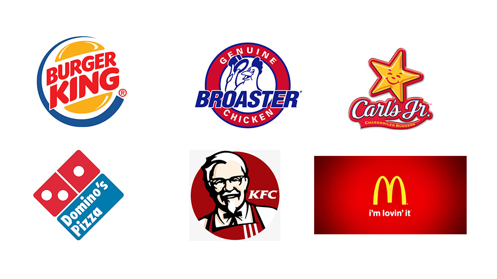
Whether it is about restaurant desin, logo, branding and marketing or for that matter food presentations we see that all top QSR brands use bright colours that increases our appetite to try a product. According to research published earlier, “Fast food restaurants globally use colours like red, yellow and blue around their stores because it revs up people's appetites, making them hungry, which therefore makes them more likely to enter the store and buy more food while they are at the store.”
Also, studies have shown that colour red is stimulating, exciting and is associated with lots of activities. And, it doesn’t however prove that this makes you hungry. “You not only eat through your tongue and taste but through your eyes and hands. It is all about involvement of senses. The food has to be presentable and attracts guest,” shared Abhijit Saha, Founding Director of Avant Garde Hospitality Pvt. Ltd that owns award winning restaurants like Caperberry and Fava.
Meanwhile colours like yellow and blue, evokes happiness and friendliness. “There are few colors that are very attractive and also entices taste buds. Red and yellow are colors used globally. However, in India red symbolises non-veg and hence has to be carefully used. We have used hot pink and yellow for our brand Dhadoom, as this combination appeals to millennial and also depicts playful recipes we serve there, added Karan Tanna, CEO, Yellow Tie Hospitality, adding that the logo colors help to create brand positioning and loyalty in long run.
Also, globally McDonald’s is changing few of its store design to green to give customers a natural, healthy feeling as green symbolizes nature and environment. Though, it might happen that brands use these colours to make them stand out remembered by the guests for long, the myth about it making people hungrier is still a question.
Hence, we can say that global brands understand the importance of colour and branding and they know how and where to use the right colours.
 New flavoursLed by Andrea Aftab Pauro, the revamp focuses on contemporary design and a variety of small plates that bring together global flavors, offering a…
 ExpansionThis new space offers diners the chance to enjoy outdoor dining in a semi-enclosed area that overlooks the children’s play area, making it a…
 McDoanld'sThis sweet treat, reminiscent of grandma’s special touch, features a delicious syrup and crunchy candy pieces blended into creamy vanilla soft serve.
 Fine Dining RestaurantToday, restaurant owners are elevating fine dining to new heights, crafting experiences that captivate all five senses.
Copyright © 2009 - 2024 Restaurant India.